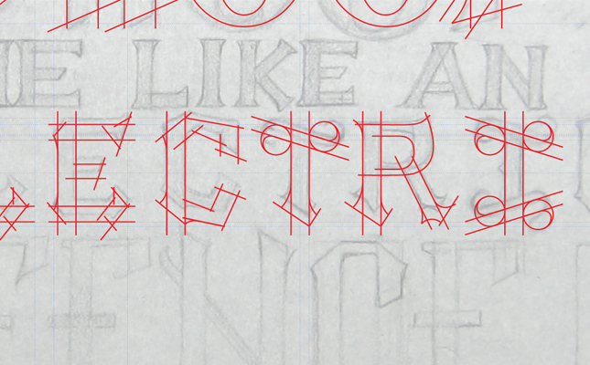
In This Lesson...
- Geometry is everywhere!
- How finding geometry in your lettering sketches benefits your ability to create clean letters and fast vectors in Adobe Illustrator
- A step by step guide for using basic Illustrator tools to find geometry in your lettering sketches
Letters Love Geometry
When it comes to tracing vector letters in Adobe Illustrator, there's one guiding principle that I find extremely useful. GEOMETRY! Don't be alarmed. I'm not a math teacher, and we won't be diving into complex terminology or formulas. I've developed a pretty simple approach to help with finding geometry in your lettering sketches, but before I explain further, there are a few helpful points worth noting:
- Geometry is everywhere! Even if you tanked Proofs & Theorems in school, your experience living as a human in a 3-dimensional world has prepared you to intuitively find geometry in your lettering sketches.
- Letters love geometry. They're inseparable, and there's nothing you can do to keep them apart.
- Your lettering sketches, whether highly structured or super flowy and organic, are packed with geometry.
- Building clean, consistent vector letters in Illustrator relies heavily on the use of simple geometric shapes and principles.
Geometry? Why?
At this point, you may be wondering, "What's the point of finding geometry in my lettering sketches? And how does it help me make clean, beautiful vector letters in Adobe Illustrator?" Here are the benefits I've discovered:
- Consistency
- When you know how to identify the basic shapes, proportions and angles that make up your lettering sketches, you don't have to give as much thought to the major construction elements of each letter. This leads to greater...
- Speed
- For example, once you've established the stem angle and width for one letter, you can confidently apply it to other letters (or refer to its proportions if the letter sizes change throughout your design).
- Accuracy
- Have you ever traced a serif with the 'Pen' tool and found that it didn't look right? I certainly have. This happens when your intuitive sense of geometry isn't partnered with a logical construction method.
- Complexity
- I believe that design complexity emerges from a strong grasp of basic fundamentals. Once you understand the 'bones' of your lettering, you'll begin to envision new and exciting opportunities to add meaningful detail to your work.
Step by Step
Below, you'll find my method for finding geometry in my lettering sketches. I've included a few GIFs to illustrate the process. Overall, it's incredibly simple. Here's what you do:
- Draw a letter in any style you wish.
- Keep in mind that the less structured the letter, the more difficult it is to discover the geometry, but I assure you it's there.
- Place a scan or photo of the sketch in an Adobe Illustrator document.
- Turn the Opacity of the sketch down to 40%, and lock the layer it's on.
- Create a new layer above the sketch layer.
- Use one of three tools to find the geometry in your lettering:
- Line Tool
- Rectangle Tool
- Ellipse Tool
Line Tool
The 'Line' tool is one of your greatest vector lettering allies. It's the first tool I use whenever I begin tracing because it helps me better understand similarities in the angles and proportions of my hand drawn letters.
Rectangle Tool
I use the 'Rectangle' tool to figure out letter thickness and create obvious parallels and perpendiculars.
Ellipse Tool
I rely on the 'Ellipse' tool to plan seamless transitions between straight lines and flowing curves. It's especially useful when building serifs.
Recap
The 'Pen' tool (and its famous bezier curves) will have its day on the Type Builder blog, but the beauty of working in Adobe Illustrator is the range of tools at your disposal. If you're new to vector tracing or simply want to improve the speed and accuracy with which you work, challenge yourself to look for the geometry in your lettering sketches. There's much to be achieved through the simplicity of a line, rectangle, or ellipse.


