In This Lesson...
- The natural proportions that exist in your lettering sketches
- Vector tracing benefits of uncovering fractional relationships in your lettering
- The 'Half' Technique
Natural Proportions
Our eyes have the incredible ability of finding aesthetically pleasing proportions in the world around us. We "just know" when something looks too tall or too short, too narrow or too wide in relation to its surroundings, and it bugs us.
When I first started learning to vector trace my hand lettering in Adobe Illustrator, I was surprised at how often I was using fractions to aid in the construction. For instance, I'd routinely find fractional relationships between the height of my capital letters, lowercase letters (X-height), and ascenders (Glossary of Type Terms). I'm no math whiz, but this happened so consistently that I decided to use it to my advantage.
Benefits
If you'll take the time to uncover the fractional relationships that naturally occur in your hand-lettering, I believe you'll reap three distinct benefits in your vector tracing process:
- You'll achieve proportional cohesion across all the letters in your design.
- This is especially helpful if your hand lettering skills are still in the early stages of development.
- You will better understand the placement of key design details.
- Useful when your lettering incorporates flourishes and fancy serifs.
- Your speed and confidence will improve.
- This happens when you can quickly reference a framework of measurements rather than start from scratch on each letter.
The 'Half' Technique
How do I ensure that I'm achieving the proper proportions in my vector lettering? I use what I call The 'Half' Technique. The 'Half' Technique can be used to find both horizontal (x-axis) and vertical (y-axis) proportions. The following explains a vertical proportion setup:
After creating your lettering sketch and placing it on a locked layer in Adobe Illustrator, you simply...
- Create a new layer titled Proportions.
- Drag guides to the top and bottom of your lettering.
- To the far left of your lettering sketch, draw a rectangle between the guides and drag a new guide to its center point.
- Copy and paste the rectangle in place (Shift-Cmd-V/Shift-Ctrl-V)
- Use the 'Free Transform' tool to pull the top edge of the new rectangle to the guide at the center point of the first rectangle...effectively reducing its height by half.
- Continue this pattern as many times as you need throughout the course of your trace.
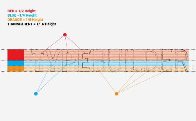
- You're looking for areas on your sketch that hit or come close to the y-axis at the same point (see illustration below).
- Reference your findings to help when tracing less resolved or troublesome letters.
- Extra Step: Take The 'Half' Technique a bit further by color coding a second set of rectangles, lowering their opacity to 25%, and scaling horizontally across your sketch.
Next Time on Type Builder...
Check back next week to learn why I believe it's easier to vector trace your lettering sketches using a stroke outline as opposed to a solid fill color.


