In This Lesson...
- Two options for vector tracing your lettering sketches in Adobe Illustrator
- The advantages of tracing with a stroke
- Quick tip for those who still prefer tracing with a fill
Stroke Vs. Fill
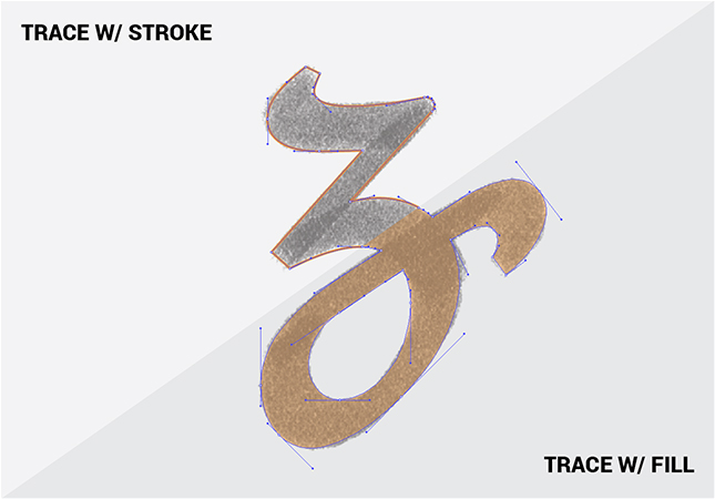
When you break out the 'Pen' tool and begin to trace your lettering sketches in Illustrator, you have two options:
- Trace with a stroke.
- Trace with a fill.
I've gone back and forth between both methods, but ultimately, I believe that vector tracing lettering sketches with a stroke is the superior option. Here's why:
- When I draw letters with a pen or pencil, I'm creating outlines which are very similar to a stroked path. This makes tracing with a stroke a more natural feeling process than tracing with a fill.
- I find tracing with a fill to be visually distracting. When I trace with a stroke, I can see my reference sketch much more clearly.
- I tend to build letters part by part rather making one continuous outline tracing. Working with strokes allows me to edit, move, and reuse individual lines and curves with ease.
- Curves, the most intimidating part of vector lettering, are easier to visualize, trace, and edit as a line than they are as a shape.
A Tip for Fill Fanatics
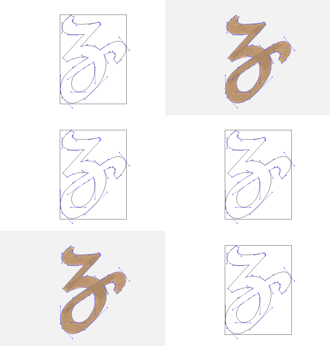
If you're a diehard devotee of tracing with a fill, but you would like to occasionally see your trace as an outline, there's a quick way to do so without having to select and switch your paths from fill to stroke:
- Cmd-Y (Mac) or Ctrl-Y (PC) switches your view to 'Outline' mode. If you don't like shortcuts, you can always go to 'View' and select 'Outline' from the very top of the drop down menu.
Next Time on Type Builder...
In the next Type Builder I'll review the practice of mapping anchor points on your lettering sketches before vector tracing.


