Why I Use Lined Paper for Hand Lettering

In This Lesson...

  • Why your hand lettering doesn't need to be perfect
  • How lined paper aids vector tracing in Adobe Illustrator
  • Different types of lined paper and a few recommendations

Functional Lettering

If your goal is to create clean, beautiful vector lettering in Adobe Illustrator, then there's something you should know. Your hand lettering sketches, those highly crafted, intricately detailed works of art that flow from your pen, don't need to be perfect! But they do need to be functional.

The vector tracing tools available in Illustrator are instruments of extreme precision that can help you easily correct any inconsistencies in your hand lettering. The goal in creating a sketch for trace is to strike a balance between having enough visual info to actually realize your vision and spending too much time on details that you can more easily correct in Illustrator. One of the best tricks I've found to help accomplish this is the use of lined paper.

Lined paper is great because:

  1. The evenly spaced lines help you make letters that are proportional to one another.
  2. It helps establish consistent placement of details, embellishments, and serifs.
  3. It acts as a built in set of guides that you can reference while you vector trace.

Lined Paper Preferences

So what kind of lined paper should you use? The kind that works best for you. You can even make your own custom lined paper. Here's what I use:

The Legal Pad

  • This is my favorite type of lined paper for lettering. It's visually simple, inexpensive, and feels soft underneath my pen. I typically use a legal pad for more ornate hand lettering.

Grid Paper

  • I like to use grid lines to create clean, structured type. It's especially useful for designing logotypes and monograms where those little geometric details and size relationships make all the difference.

Elementary Ruled

  • If you like using ink brushes to create scripts, then you know how hard it can be to achieve consistency due to their curvy, flowing nature. Ementary ruled paper (which is meant to aid youngsters in penmanship) is a great practice tool and confidence builder, and its differing line styles help create size distinctions when vector tracing.

Next Time on Type Builder...

If vector tracing the letter 'S' has ever driven you to the edge of insanity, then visit Type Builder next Tuesday (12/29) to learn a simple construction technique that is sure to renew your confidence.

PS...I just created the Type Builder newsletter. Sign up below to have Type Builder delivered directly to your inbox!



A Timely Tip for Illustrator's Rotate Tool

In This Lesson...

  • Why you should use Adobe Illustrator's 'Rotate' tool
  • How to rotate around a manually selected reference point
  • Using the 'Selection' tool to rotate with confidence

Rotational Excellence

If you're a pro at using Adobe Illustrator to vector trace your hand lettering, then this lesson might be obvious to you. But you know what, it's so dang useful that I'll go ahead and risk your boredom.

When I'm vector tracing my hand lettering and I need to rotate something, I prefer to use the actual 'Rotate' tool (hotkey 'R') so that I don't risk accidentally scaling, skewing, or moving the shape or path I'm working with. My favorite 'Rotate' tool feature is the ability to manually select the rotation/reference point. Why is this so useful?

  1. It allows for extreme precision, especially when used with Smart Guides.
  2. It saves a ton of time.
    • When I was first starting out, I spent close to a year rotating every object from its center point. Rotate, reposition. Rotate, reposition. Over and over...

The 'How'

How exactly do you manually select the rotation point when using the 'Rotate' tool? It's easy!

  1. Select the object(s) you'd like to rotate.
  2. Pick the 'Rotate' tool or press 'R'.
  3. Click the point you want your object(s) to rotate around.
  4. Bada bing!

A similar method that involves the 'Selection' tool may come in handy when rotating circles, ellipses, and irregular shapes and paths:

  1. Select the object(s) you'd like to rotate.
  2. Click on the 'Selection' tool or press 'V'.
  3. Select the reference point you'd like to use from the 9-box grid located in the 'Transform' panel.
  4. Choose a corner of the 'Bounding Box' surrounding your object(s) and rotate away!

Next Time on Type Builder...

On the next Type Builder, I'll encourage you to revisit your 'wide-ruled' past and discuss how using lined paper for your hand lettering gives you a leg up when it comes to vector tracing in Adobe Illustrator.


Mapping Anchor Points Before You Trace

In This Lesson...

  • Having a plan before you trace
  • Mapping anchor points in your lettering sketches
  • Should you map your anchor points?
  • The all-important extrema

Plan Ahead

Like any successful construction project, building great type takes planning and preparation before the tracing ever takes place. If you jump into vector tracing your lettering sketches without a plan of approach, you're likely to run into headaches (as I often encountered when I was starting out).

Mapping Anchor Points

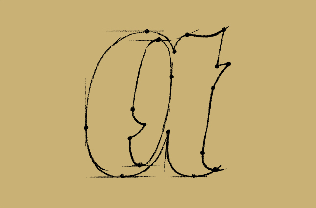
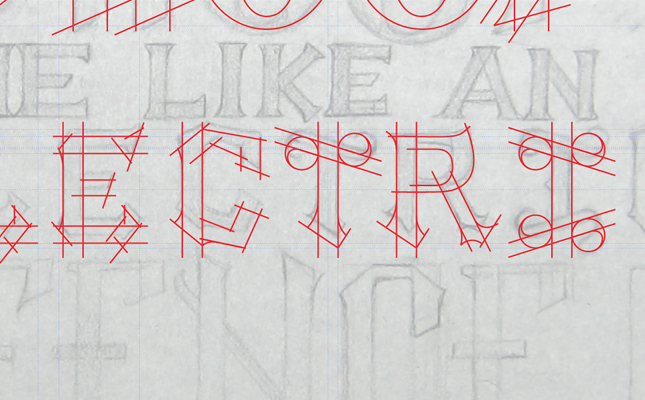
One practice that lettering artists use to help with planning during the sketching phase is mapping out anchor points. What's this look like?

The idea is that by figuring out where crucial anchor points are before you trace, you're setting yourself up for an easier time working with those "dreaded" bezier curves in Illustrator (they're really not that bad). Naturally, the question becomes, "Is this a useful technique?" Absolutely, it is, but with a few conditions...

  1. Hopefully, you have some sort of basic understanding of how the 'Pen' tool works in Adobe Illustrator. If you don't, that's ok. It's a learned skill, not an innate ability. But, the first few times you map anchor points will probably be useless as far as your trace is concerned. Regardless, give it a try, and learn from your mistakes.
  2. If you're the kind of person that gets super stressed when things don't go according to plan, mapping your anchor points could be a bad idea. Lines and curves that look good on paper have a way of turning wonky tonk during the vector trace. Bottom line, you will have to make adjustments on the fly in Illustrator.
  3. Are you like me? Do you love the design process but sometimes feel bogged down by all the steps? If so, then it's important that you understand that the design process doesn't exist to rule over you, it exists to offer clarity and direction as you find your way from concept to execution. You don't have to map out your anchor points. It's a useful step, but the only way to get better at vector tracing in Illustrator is practice.

The Extrema

If you do decide to map out anchor points in your lettering sketches, there's one concept you'll need to grasp in order to make it a useful practice: the Extrema

Put simply, anchor points should be placed at the highest, lowest, leftmost, and rightmost parts of your letters...the extremes. A quick way to begin understanding the extrema in your lettering is to draw a rectangle around the outermost points of each letter in your sketch:

You can take this technique as far as you'd like, but be warned that it can clutter up your sketch in a hurry:

Mapping-Points_003.jpg

Next Time on Type Builder...

Check back soon for the next Type Builder, when I'll be discussing the efficiency, power, and simplicity of the 'Rotate' tool.


Vector Tracing with a Stroked Path

In This Lesson...

  • Two options for vector tracing your lettering sketches in Adobe Illustrator
  • The advantages of tracing with a stroke
  • Quick tip for those who still prefer tracing with a fill

Stroke Vs. Fill

When you break out the 'Pen' tool and begin to trace your lettering sketches in Illustrator, you have two options:

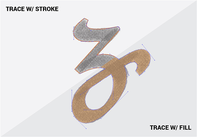
  1. Trace with a stroke.
  2. Trace with a fill.

I've gone back and forth between both methods, but ultimately, I believe that vector tracing lettering sketches with a stroke is the superior option. Here's why:

  1. When I draw letters with a pen or pencil, I'm creating outlines which are very similar to a stroked path. This makes tracing with a stroke a more natural feeling process than tracing with a fill.
  2. I find tracing with a fill to be visually distracting. When I trace with a stroke, I can see my reference sketch much more clearly.
  3. I tend to build letters part by part rather making one continuous outline tracing. Working with strokes allows me to edit, move, and reuse individual lines and curves with ease.
  4. Curves, the most intimidating part of vector lettering, are easier to visualize, trace, and edit as a line than they are as a shape.

A Tip for Fill Fanatics

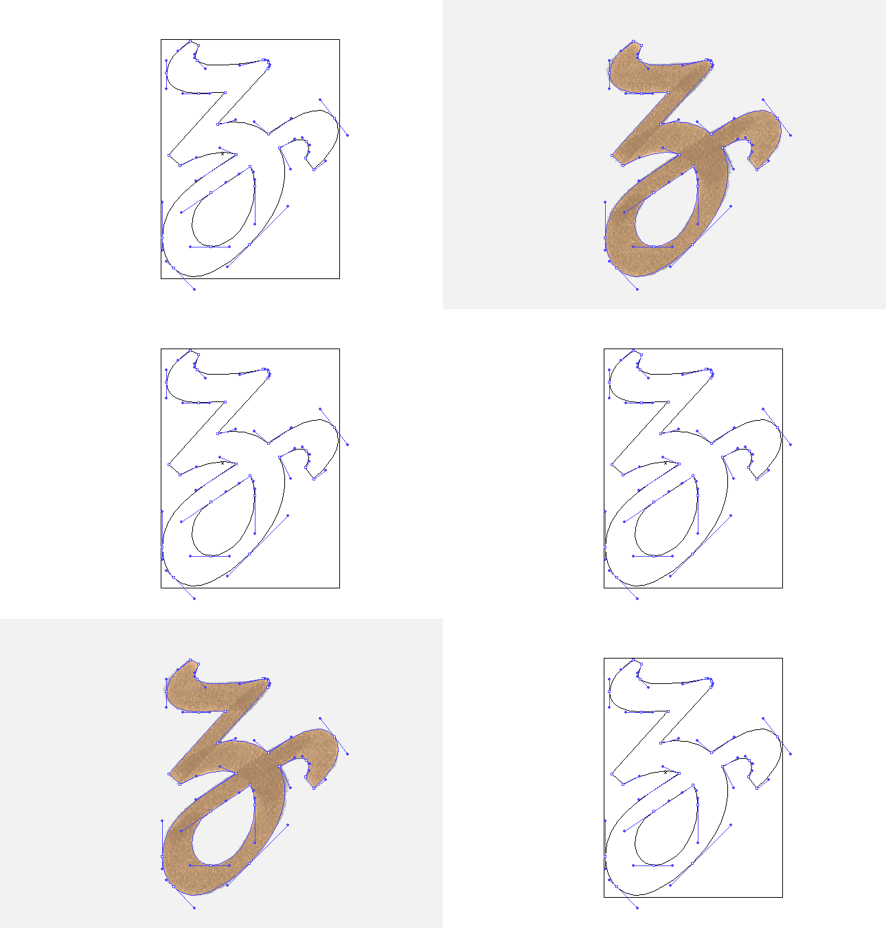
If you're a diehard devotee of tracing with a fill, but you would like to occasionally see your trace as an outline, there's a quick way to do so without having to select and switch your paths from fill to stroke:

  • Cmd-Y (Mac) or Ctrl-Y (PC) switches your view to 'Outline' mode. If you don't like shortcuts, you can always go to 'View' and select 'Outline' from the very top of the drop down menu.

Next Time on Type Builder...

In the next Type Builder I'll review the practice of mapping anchor points on your lettering sketches before vector tracing.


Fractions & Perfect Letter Proportions

In This Lesson...

  • The natural proportions that exist in your lettering sketches
  • Vector tracing benefits of uncovering fractional relationships in your lettering
  • The 'Half' Technique

Natural Proportions

Our eyes have the incredible ability of finding aesthetically pleasing proportions in the world around us. We "just know" when something looks too tall or too short, too narrow or too wide in relation to its surroundings, and it bugs us.

When I first started learning to vector trace my hand lettering in Adobe Illustrator, I was surprised at how often I was using fractions to aid in the construction. For instance, I'd routinely find fractional relationships between the height of my capital letters, lowercase letters (X-height), and ascenders (Glossary of Type Terms). I'm no math whiz, but this happened so consistently that I decided to use it to my advantage.

Benefits

If you'll take the time to uncover the fractional relationships that naturally occur in your hand-lettering, I believe you'll reap three distinct benefits in your vector tracing process:

  1. You'll achieve proportional cohesion across all the letters in your design.
    • This is especially helpful if your hand lettering skills are still in the early stages of development.
  2. You will better understand the placement of key design details.
    • Useful when your lettering incorporates flourishes and fancy serifs.
  3. Your speed and confidence will improve.
    • This happens when you can quickly reference a framework of measurements rather than start from scratch on each letter.

The 'Half' Technique

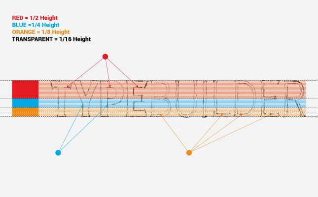
How do I ensure that I'm achieving the proper proportions in my vector lettering? I use what I call The 'Half' Technique. The 'Half' Technique can be used to find both horizontal (x-axis) and vertical (y-axis) proportions. The following explains a vertical proportion setup:

After creating your lettering sketch and placing it on a locked layer in Adobe Illustrator, you simply...

  • Create a new layer titled Proportions.
  • Drag guides to the top and bottom of your lettering.
  • To the far left of your lettering sketch, draw a rectangle between the guides and drag a new guide to its center point.
  • Copy and paste the rectangle in place (Shift-Cmd-V/Shift-Ctrl-V)
  • Use the 'Free Transform' tool to pull the top edge of the new rectangle to the guide at the center point of the first rectangle...effectively reducing its height by half.
  • Continue this pattern as many times as you need throughout the course of your trace.
    • You're looking for areas on your sketch that hit or come close to the y-axis at the same point (see illustration below).
    • Reference your findings to help when tracing less resolved or troublesome letters.
    • Extra Step: Take The 'Half' Technique a bit further by color coding a second set of rectangles, lowering their opacity to 25%, and scaling horizontally across your sketch.

Next Time on Type Builder...

Check back next week to learn why I believe it's easier to vector trace your lettering sketches using a stroke outline as opposed to a solid fill color.


Find Geometry in Your Lettering Sketches

In This Lesson...

  • Geometry is everywhere!
  • How finding geometry in your lettering sketches benefits your ability to create clean letters and fast vectors in Adobe Illustrator
  • A step by step guide for using basic Illustrator tools to find geometry in your lettering sketches

Letters Love Geometry

When it comes to tracing vector letters in Adobe Illustrator, there's one guiding principle that I find extremely useful. GEOMETRY! Don't be alarmed. I'm not a math teacher, and we won't be diving into complex terminology or formulas. I've developed a pretty simple approach to help with finding geometry in your lettering sketches, but before I explain further, there are a few helpful points worth noting:

  1. Geometry is everywhere! Even if you tanked Proofs & Theorems in school, your experience living as a human in a 3-dimensional world has prepared you to intuitively find geometry in your lettering sketches.
  2. Letters love geometry. They're inseparable, and there's nothing you can do to keep them apart.
  3. Your lettering sketches, whether highly structured or super flowy and organic, are packed with geometry.
  4. Building clean, consistent vector letters in Illustrator relies heavily on the use of simple geometric shapes and principles.

Geometry? Why?

At this point, you may be wondering, "What's the point of finding geometry in my lettering sketches? And how does it help me make clean, beautiful vector letters in Adobe Illustrator?" Here are the benefits I've discovered:

  1. Consistency
    • When you know how to identify the basic shapes, proportions and angles that make up your lettering sketches, you don't have to give as much thought to the major construction elements of each letter. This leads to greater...
  2. Speed
    • For example, once you've established the stem angle and width for one letter, you can confidently apply it to other letters (or refer to its proportions if the letter sizes change throughout your design).
  3. Accuracy
    • Have you ever traced a serif with the 'Pen' tool and found that it didn't look right? I certainly have. This happens when your intuitive sense of geometry isn't partnered with a logical construction method. 
  4. Complexity
    • I believe that design complexity emerges from a strong grasp of basic fundamentals. Once you understand the 'bones' of your lettering, you'll begin to envision new and exciting opportunities to add meaningful detail to your work.

Step by Step

Below, you'll find my method for finding geometry in my lettering sketches. I've included a few GIFs to illustrate the process. Overall, it's incredibly simple. Here's what you do:

  1. Draw a letter in any style you wish.
    • Keep in mind that the less structured the letter, the more difficult it is to discover the geometry, but I assure you it's there.
  2. Place a scan or photo of the sketch in an Adobe Illustrator document.
  3. Turn the Opacity of the sketch down to 40%, and lock the layer it's on.
  4. Create a new layer above the sketch layer.
  5. Use one of three tools to find the geometry in your lettering:
    • Line Tool
    • Rectangle Tool
    • Ellipse Tool

Line Tool

The 'Line' tool is one of your greatest vector lettering allies. It's the first tool I use whenever I begin tracing because it helps me better understand similarities in the angles and proportions of my hand drawn letters.

Rectangle Tool

I use the 'Rectangle' tool to figure out letter thickness and create obvious parallels and perpendiculars. 

Ellipse Tool

I rely on the 'Ellipse' tool to plan seamless transitions between straight lines and flowing curves. It's especially useful when building serifs. 

Recap

The 'Pen' tool (and its famous bezier curves) will have its day on the Type Builder blog, but the beauty of working in Adobe Illustrator is the range of tools at your disposal. If you're new to vector tracing or simply want to improve the speed and accuracy with which you work, challenge yourself to look for the geometry in your lettering sketches. There's much to be achieved through the simplicity of a line, rectangle, or ellipse.


My Top 5 Tools for Hand Lettering

In This Lesson...

  • Practice > Tools
  • My top 5 tools for hand lettering, including...
    • Price
    • Where to purchase
    • Pros & Cons

Practice. Practice. Practice.

There are a bunch of ways to approach vector lettering. I've tested many, but my tried and true method is two steps and super effective:

  1. Draw letters.
  2. Trace letters in Adobe Illustrator.

Because Step 1 involves drawing, a question that I hear often is, "What pen/pencil did you use to draw that?" Some lettering artists don't like this question, but I don't mind it, because when I was starting out, I asked it too. The truth is, there are countless tools that can be used to make beautiful marks and lines for hand-lettering, but even more important than the pen you put on your paper is the practice you put into your craft. Tips, tricks, tools, and techniques are useless without practice.

My Top 5 Tools for Hand Lettering

I love trying out new markers, pens, and pencils, and I recommend that you experiment with as many different types as you can. The list below covers the five tools that I use for consistently great results.

  1. Copic Sketch Marker (Brush Tip)
    • $5.25 @ DickBlick.com
    • Pros
      • Nib point holds up under lots of abuse
      • Nib is flexible but not too soft for beginners
      • Doesn't smear on tracing paper
    • Cons
      • Best when used with some sort of marker paper
      • Ink bleeds and runs out quickly when used on cheap printer paper
  2. Chartpak Ad Marker (Chisel Tip)
    • $3.00 @ DickBlick.com
    • Pros
      • Has a wide, sharp chisel that allows for strokes of varying thickness
      • Black ink is extra smooth and highly opaque
      • Comes in a variety of lighter colors that can be used to build up letter forms with multiple strokes
    • Cons
      • So stinky that anyone nearby is sure to flash you some side-eye
  3. Pilot Precise V5 Pen
    • $1.90 @ JetPens.com
    • Pros
      • Has a tiny 'Rollerball' in the tip that makes for a smooth, gliding feel and results in clean linework
      • Comes in several colors (I like using red to edit my sketches)
    • Cons
      • A little less precise than Micron pens (but still a better drawing experience, IMHO)
  4. Bic #2 Mechanical Pencil (.07mm)
  5. Wacom Intuos Pen (Stylus)
    • Multiple product offerings @ Wacom.com
    • I frequently use a stylus for sketch refinements in Photoshop. It's a great way to speed up your workflow and quickly explore different design choices. Browse through the Wacom website and you'll soon find that there are a lot of different setups to choose from. It all depends on how you like to work, but here's what I use:
      1. Wacom Intuos and desktop computer
        • Best for refinement and precision sketching
      2. Wacom tablet stylus and iPad
        • Great way to capture ideas outside of your studio

Recap

When it comes to drawing letterforms for vector tracing, I've used everything from tree bark to butter knives. Don't misunderstand...tools matter, but a commitment to routine practice and experimentation is the only way to build lasting skill. The markers, pens and pencils you purchase don't need to be exotic or expensive; they just need to be reliable and suited to the style you're trying to achieve.


Welcome to Type Builder!

Intro_Header-Image_001.jpg

Origins

Four years ago, I discovered the work of a few designers who had dedicated their careers to the art of hand lettering, and I was so inspired that I decided to try it for myself. After a couple of months spent practicing with various pens and markers, I wondered if I could make a clean vector trace of my lettering in Adobe Illustrator. I gave it a try, but the results were embarrassingly bad:

  • The thickness of my letters was inconsistent.
  • I had noticeable flat spots on most of my curves.
  • And there were visible corners and kinks where I wanted smooth transitions.

Even worse, the trace didn't come close to resembling my original sketch. The whole process seemed clunky and slow, and I felt like it was pointless to try again. Luckily, I didn't quit. Instead, I decided to learn everything I could about tracing my sketches with vector paths in Illustrator. Over time, three things happened:

  1. I gradually developed my own approach to vector lettering.
  2. I found that I could tweak well known Illustrator techniques to help create beautiful letterforms.
  3. And I discovered that some practices are universal no matter what is being traced.

Now, four years later, I've decided it's time to share the lessons I've learned.

Why would I do that?

I've spent hundreds of hours digging through Adobe Illustrator tutorials and help forums. The amount of useful information on creating clean vector paths is astounding. If you're new to vector tracing, there are a ton of great resources available at the convenience of a Google search!

Because I've benefited so much from what other artists and designers have freely shared online, I think it's only fair that I continue the tradition.

Type Builder Basics

If there's one thing that I've always found frustrating about learning from online tutorials, it's the amount of information packed into them. Sometimes, the sheer density of a lesson can be overwhelming, especially with time in short supply and deadlines approaching.

With that in mind, I created Type Builder. Here's a quick breakdown of the Type Builder Basics:

  • What is Type Builder?
    • Type Builder is a place to find quick vector lettering tips for Adobe Illustrator.
  • Who is Type Builder for?
    • Type Builder is for anyone who wants to make beautiful, custom type in Illustrator.
  • Why should someone visit Type Builder?
    • Building vector letterforms can be tricky. Capturing the warmth and character of handdrawn lettering with clean vector paths is even trickier. Type Builder offers practical tips to help demystify the vector construction process.
  • When and where will Type Builder updates be made?
    • New posts will be added every Tuesday, and I'll also be posting reminders on my Instagram and LinkedIn profiles.
  • How can you get the most out of Type Builder?
    • Think of Type Builder as quick, compact lessons. Each lesson presents one important tip, trick, technique or tool that you can add to your vector lettering repertoire.

Getting Started

That's all you need to know to get started with Type Builder. I've got a lot of great lessons planned, so keep checking in over the coming weeks and months to learn more about how you can make clean letters and fast vectors!