Draw Organic Letters Using Illustrator's Pencil Tool

In This Lesson...

  • A way to break free from Illustrator's 'Pen' tool
  • The organic possibilities of Illustrator's 'Pencil' tool
  • A step-by-step approach to using the 'Pencil' tool for clean, flowing letterforms

Vector Naturalist

So, you just drew this super organic letterform. It's all flowy and curvy and intricately detailed, and now you're wondering, "How do I vector this thing? Do I seriously have to endure the tedium of the 'Pen' tool's point-by-point precision? What's the point of creative spontaneity if I have to be confined to the geometric limits of bezier handles?!?"

Take heart, embattled letterer! There's another way, a more natural, hands-on way. Behold, the 'Pencil' tool. One of Illustrator's unsung heros, the 'Pencil' tool provides hand lettering artists with a way to trace organic letterforms that's as easy as using...a pencil.

Here's how it works (Note: This method works best if you're using a drawing tablet like an Intuos.)

DRAW

  • Draw up any letter, using any organic style you like.

SCAN

  • Now scan or photograph that drawing, and drop it into a locked layer in Adobe Illustrator.

TOOL SETTINGS

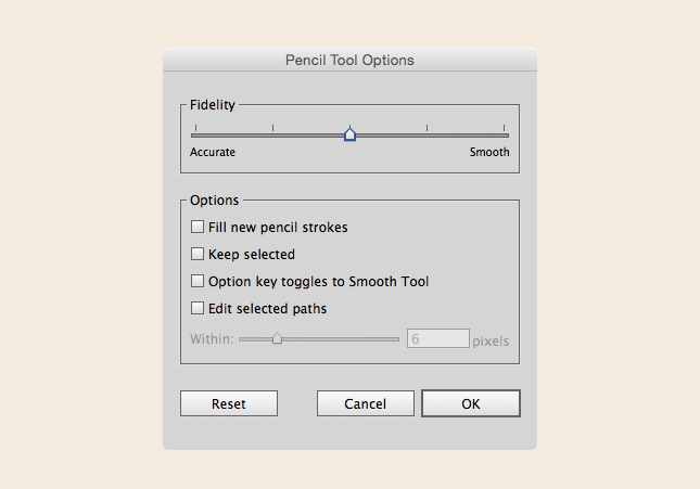
  • Double click the 'Pencil' tool to bring up its settings box. There are a few different levels of control, and the options you select really do have an impact on line quality and workflow. Experiment to find the settings that work best for you and the letter you're tracing. Here's a screenshot of the settings I use most frequently:

PATH STYLE SETTINGS

  • Feel free to use the path style, color, and thickness you prefer. I typically use the 'Pencil' tool as a means of shape creation, so I keep these settings simple:

TRACE

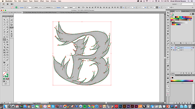
  • Now that you're all set up, use your stylus to trace your letterform as accurately as you can. Go ahead and let paths intersect, and don't worry if the trace starts to look a little messy. You'll clean it up a bit later.

MERGE

  • Highlight all the paths you created, and use the 'Shape Builder' tool to merge your letterform into a shape. Then, hide the shape, and delete any leftover segments.
  • 'Hide' Object Shortcut: Cmd-3 (Mac) or Ctrl-3 (PC)
  • 'Unhide' Object Shortcut: Cmd-Alt-3 (Mac) or Ctrl-Alt-3 (PC)

REFINE

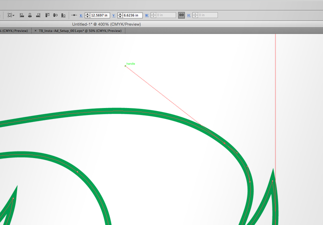
  • Just like with the 'Pen' tool, you may want to tweak and adjust your new shape until it looks the way you intend.

Bingo Bango!

You just achieved a clean, beautiful letterform with flowing, organic appeal, and you did so completely free of the 'Pen' tool's iron grip!

Next Time on Type Builder

Just like you, I'm always learning new things about making letters. Recently, I started experimenting with Adobe Illustrator's 'Width' tool, and I couldn't be more excited to share the lettering possibilities it's opened up. Check back next week to learn a few basic tips that may change your entire approach to vector lettering!

PS...Sign up below to have Type Builder delivered directly to your inbox!


Brush Pen Lettering for Adobe Illustrator

In This Lesson...

  • The popularity of brush pen lettering
  • A reminder about practice
  • How to turn your crappy brush pen lettering into beautiful client work

Brushy & Beautiful

Every time I'm on Instagram, I see tons of amazing posts featuring brush pen lettering work. The level of talent is inspiring, and I love seeing more people exploring the incredible creative capabilities of pen and paper. That being said, if you ever actually pick up a brush pen and put it to use, you'll soon find that it takes serious skill to draw beautiful letterforms with the flick of a wrist.

Brushy & Blah

If your brush pen lettering stinks (as mine often does), there's only one way to see improvement - PRACTICE! Like any artistic skill worth having, it takes time to develop command, but eventually you'll see positive results. In the meantime I have a wild suggestion: Even if you're not very good, use brush pen lettering in your client work! Don't worry, I'm not trying to derail your design career.

Brushy & Benjamin$

As I mentioned earlier, my own brush pen lettering isn't too hot, but I still use it in my client work because it provides character and freedom of expression that ready-made fonts often fail to deliver...plus it's easy! Here's how I use it:

DRAW

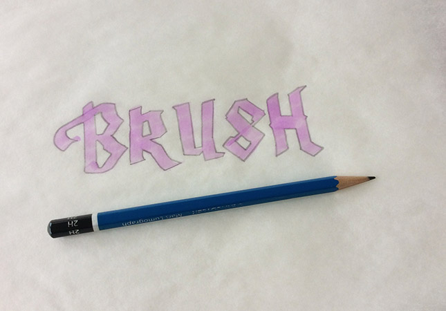
  • Using a light colored marker with a brush nib, draw a word using whatever style suits you.

REFINE

  • Refine your letters with a pencil directly on top of the brush pen markings. (One of the perks of using a brush pen is that the thickness of your letters should be relatively consistent throughout.)

SCAN

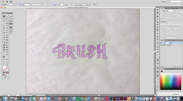
  • Scan or photograph your lettering, and place it on a locked layer in Adobe Illustrator.

TRACE

  • It's showtime! When you finish this step, you'll have a 100% custom set of letters that will make your clients beam!

As you can see, using your brush pen lettering is a straightforward process that yields one-of-a-kind results. Using it for client work is a great way to build confidence in your hand lettering, and it gives you the opportunity to further practice vector tracing.

Next Time on Type Builder

Adobe Illustrator's 'Pencil' tool is an overlooked vector lettering hero. On the next Type Builder, I'll show how I use the 'Pencil' tool to achieve clean letters with a loose, handmade feel.

PS...Sign up below to have Type Builder delivered directly to your inbox!


Remove Excessive Anchor Points from Your Lettering

In This Lesson...

  • How too many anchor points makes vector lettering a pain
  • Astute Graphics' 'Smart Remove Brush' Tool

Excessively Anchored

Here's the scenario: You've handdrawn a beautiful, script styled 'Z' and painstakingly vector traced it in Adobe Illustrator using a stroked, calligraphic brush. Nice work!

Now, for any number of reasons, let's say that you have to outline your stroked path(s) to create a shape.

Yuck! Look at all those anchor points! You may not know it, but these little guys can turn your vector lettering project into a hellish nightmare. How? By nullifying bezier handle control and severely impeding your ability to modify shapes quickly and accurately. Take a look at this video and see how difficult it is to manage all these points when editing.


Clean Letters. Fast Vectors. 

So, how does one quickly remove the excessive anchor points that come with outlining a stroked path? There are a couple of options, but there's only one tool that I absolutely trust to maintain the core geometry of shapes while removing non-essential anchor points: Astute Graphics' 'Smart Remove Brush' tool (part of the VectorScribe v2 plug-in pack).

Check out the video below to see the 'Smart Remove Brush' tool in action. The tool is super simple to use, just point and click, but it also has variables that allow you to control brush size and strength. I started using the 'Smart Remove Brush' two years ago, and it's been an extreme time saver with my client work.  If you're intrigued, I'd recommend downloading the free trial to experiment and see whether or not this tool would be a helpful addition to your workflow.


Next Time on Type Builder

The hand lettering scene is bursting with beautiful brush pen work. Brush pens are a great way to add style and character to any design, but you don't have to be a master penman to use them effectively. Check back next time for some practical tips on using brush pen markings as a base for vector tracing sophisticated letterforms.

PS...Sign up below to have Type Builder delivered directly to your inbox!


Extend and Trim Illustrator Paths with Ease

In This Lesson...

  • A better way to extend and trim vector paths in Adobe Illustrator
  • Capabilities of the 'Path Extend' tool
  • Using the 'Path Extend' tool for vector lettering
  • Thoughts on investing in tools

My Favorite Plugin

Let's get right to the point. When you're vector tracing hand lettering in Adobe Illustrator, there will come a time when you'll need to make a path you've drawn shorter or longer. Traditionally, this would be a task for the 'Pen' tool, but there's a highly effective alternative available.

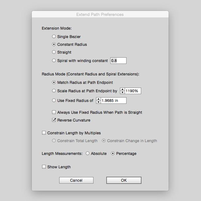
Last time on Type Builder, I introduced Astute Graphics (AG) plugins for Adobe Illustrator and went on and on about how good they are. Well, my feelings haven't changed, and I'm genuinely excited to introduce AG's 'Path Extend' tool. Easily my favorite feature of the AG VectorScribe v2 plugin set, the 'Path Extend' tool is feature packed and the perfect addition to your vector lettering toolbox.

Features Galore!

So, what exactly is the 'Path Extend' tool capable of?

  • Lengthening paths using one of four extension modes:
    1. Single Bezier
    2. Constant Radius
    3. Straight
    4. Spiral with Winding Constant
  • Shortening paths
  • Trimming paths to points of intersection with other paths or guides
  • Reversing the curvature of a path
  • Lengthening or shortening paths based on specific distances

Additionally, the 'Path Extend' tool has an easy-to-use control panel that allows for tweaking all kinds of variables.

Lettering & The 'Path Extend' Tool

Now that I've introduced the 'Path Extend' tool, I'd like to share five practical ways that I use it to help vector trace my hand lettering in Illustrator:

  1. Visualizing and reshaping paths along more natural, geometrically sound curves
    • This becomes particularly useful when the curves in your reference sketch aren't quite right (flat, skewed, too round, etc).
  2. Quickly adding or subtracting long path segments with precision
  3. Closing small gaps before using the 'Shape Builder' tool
  4. Adding detail and flourishes using the 'Spiral' extension option
  5. Freestyling new, undrawn curves with confidence

Check out this quick video to see the 'Path Extend' tool in action.


A Word on Cost

It's worth mentioning that Astute Graphics plugins aren't cheap. They're high end vector drawing tools, and acquiring them is an investment. With time and practice, the return on your investment will mirror the Type Builder motto, "Clean Letters. Fast Vectors." When you work clean and fast, you stand to profit from your vector lettering abilities. If you're on the fence, I recommend you...

  • Browse the Astute Graphics website for more information
  • Download the 14-day free trial and try the plugins for yourself
  • Leave a question for me in the 'Comments' section below

Next Time on Type Builder

On the next TypeBuilder, I'll review another nifty Astute Graphics tool that helps smooth out rough spots in curves and remove excessive anchor points (which can make editing paths a nightmare).

PS...Sign up below to have Type Builder delivered directly to your inbox!


Improve Vector Lettering with Astute Graphics Plug-ins

In This Lesson...

  • A vector lettering artist's guilty confession
  • Adobe Illustrator's drawing limitations
  • The beautiful simplicity of Astute Graphics plug-ins
  • Really rhetorical questions

Coming Clean

I have something of a confession to make. A dirty, little secret. I'm not an Adobe Illustrator purist. In fact, I never have been. Let me explain...

The first graphics software I learned to use was a CAD program meant for Engineers and Product Designers. It was confusing and packed with complex capabilities, but over time, I learned to draw efficiently and create whatever I saw in my mind's eye. Years later, as I made the transition to Graphic Designer, I figured I'd better start learning Adobe Illustrator. Immediate frustration! Illustrator's drawing capabilities (though getting better) are puny when compared to the control and accuracy found in most CAD programs, but it is what it is. "Deal with it," I told myself, and I did for a few years. But when I started attempting to vector trace my hand lettering, Illustrator's weaknesses became even more glaring. As a design service provider, time is money, so I set out to find if there were any Illustrator plug-ins that could help increase my drawing efficiency and precision.

Introducing Astute Graphics

Surprisingly, there were quite a few plug-ins available. Some are made by regular guys and gals just trying to solve annoying Illustrator problems, and some are super sophisticated and meant to give Illustrator a more CAD-like feel. For me, the most intriguing option was a company called Astute Graphics. In addition to glowing reviews from well-known designers and a clean, easy to navigate website, they offered a 100% free plugin set called SubScribe that provides basic geometry features Illustrator is sorely lacking. Anyhow, I decided to give SubScribe a chance, and within the first hour of use I was so impressed that I downloaded the trial versions of three additional plug-ins. Seriously, they're amazing (and well worth the price)!

Workflow Wonders!

In the coming weeks I'll be sharing my favorite Astute Graphics plug-ins and how I use them to churn out fast and accurate vector traces of my hand lettering. But to pique your interest and keep you coming back for more (hopefully), here's a collection of rhetorical questions that provide a bit of insight into the amazing capabilities offered by Astute Graphics:

  • Extend Path
    • Have you ever longed for an easier, more sophisticated way of making a path longer or shorter?
  • Smart Remove/Add Anchor Point
    • Would you like an easy way to remove little kinks in your vector paths, or have you ever wondered where the perfect place for an anchor point might be?
  • Smart Path Connection
    • What do you do when you need to create a smooth, seamless connection between two paths?
  • Live Multi-Angle Mirroring
    • Wouldn't it be great if you could mirror parts of your vector work in real time, at any angle, across over 70 axes?
  • Tangency Tools
    • Can you imagine a world where you don't have to use multiple guides and 1000% zoom to achieve tangency between two paths?

Next Time on Type Builder

The ability to intelligently trim and extend paths is a huge advantage when it comes to vector tracing hand lettering in Adobe Illustrator. On the next Type Builder, I'll introduce Astute Graphic's 'Extend Path' tool and offer some practical tips that are sure to help you achieve fast and clean vector letters.

PS...Sign up below to have Type Builder delivered directly to your inbox!

How I Ease The Aches of Hand Lettering

Ominous Disclaimer: I'm not a healthcare professional in any way...just a guy that makes letters, logos, and drawings. The following Type Builder post isn't medical advice. In fact, it's not advice at all. It's just me sharing something I do to help ease the aches and pains of vector lettering. Use at your own discretion.

In This Lesson...

  • The aches and pains of physical inactivity
  • Thoughtful consideration
  • A quick and easy movement circuit

Achy Breaky

Design is a profession, and it is a passion, and I love that I get to wake up each day and dive into projects that are both challenging and fulfilling. However, working on a computer every day, day after day, has a way of making my eyes, neck, back, shoulders, hands and hips super sore. When I get stiff and sore, I also get grumpy, and my creative and technical abilities suffer.

To combat the effects of peering into my monitor for hours at a time, I've created a series of easy-to-perform movement circuits that get my blood flowing, help me refocus, and renew my creative energy. Today, I'd like to share one of these circuits. It takes about 5 minutes to complete.

Pause & Consider

Before starting, there are a few things I always try to stop and think about:

  • Breath - When I do this circuit, I heed my inner Bryan Kest and focus on deep and steady nose breathing throughout. If I get winded, I back off and simply focus on my breath.
  • Stability - Depending on the movement, I sometimes use a chair, wall, or table to help me balance.
  • Pain - If a movement causes me pain, I stop doing it and move on to another. Or I focus on breathing.

Type Builder Movement Circuit

(Unfortunately, the TypeBuilder budget isn't hefty enough to hire a fitness model. Here's a bearded guy wearing stretch jeans and a Carhartt vest instead.)

1. Stand and stretch to sky (15 reps)

2. Single leg knee raise (10 reps on each leg)

3. Side-to-side stepping (20 reps)

4. Fist squeeze curls (15 reps)

5. Modified airplane (20 reps)

6. Single leg kick (10 reps on each leg)

7. Heel pointers (15 reps on each heel)

Vector tracing hand lettering in Adobe Illustrator requires deep mental focus but very little physical activity. I'm always surprised at how creaky my body gets from simply sitting and clicking a mouse, but I've found that routinely getting up from my desk to work through some basic movements is a great way to break up an intense trace session and reinvigorate both mind and body.

Next Time on Type Builder

Fancy tools don't develop skills (only practice does that), but having the right tools and knowing how to use them can greatly increase your confidence and efficiency. On the next Type Builder, I'll introduce a company whose tools helped take my Adobe Illustrator capabilities to another level. 

PS...Sign up below to have Type Builder delivered directly to your inbox!


Lettering with Illustrator's 'Shape Builder' Tool

In This Lesson...

  • Difficulties of tracing anchor point to anchor point
  • Drawing lines past their intended stopping point
  • How to use the 'Shape Builder' tool to improve your vector tracing

A New Approach

As I continue to learn more about the art of vector lettering in Adobe Illustrator, I sometimes step back, think about my process as a whole, and try to hone in on the tools and techniques that are most essential. Recently, I realized that there is one tool that truly revolutionized my approach to vector tracing letterforms: The 'Shape Builder' tool.

Outline & Anchor Point Headaches

Before discovering the "Shape Builder' tool, I would trace the entire outline of each letter in my composition one anchor point at a time. Working this way drove me nuts for three reasons:

  1. Inconsistent Construction
    • When each letter in a composition is traced individually, it's more likely that your finished, vector letterforms will lack cohesion. The cold precision of a vector path is much less forgiving of inconsistencies than the warm, fuzzy quality of a hand drawn pencil marking.
  2. Shape & Edge Confusion
    • Sometimes it can be difficult to visualize and trace paths properly at major intersections and transitions. Outline tracing one anchor point at a time requires a high level of bezier handle command that most beginners simply don't have.
  3. Inability to Reuse Letter Parts
    • When different letterforms share similar design elements, I think it's much faster and more efficient to reuse rather than retrace.

Drawing Lines "Long"

When I discovered the 'Shape Builder' tool, it was a complete accident, but I immediately realized its potential for aiding in the vector trace of letterforms. In college I trained as an Industrial Designer, and one of the most valuable things I learned during that time was the practice of drawing lines well past their intended stopping point. Doing so frees up the drawing muscles in your arm and hand, which leads to increased confidence, greater precision establishing angles and intersections, and ultimately, cleaner, more beautifully drawn forms. 

Out of habit, I carried the practice of drawing lines "long" into my hand lettering, but outline tracing letters anchor point by anchor point requires a different, less intuitive way of thinking. The result of merging these disparate practices was hours of frustration and vector letters that failed to match what I saw in my mind and on my sketchpad.

Trace Like You Draw

Using the 'Shape Builder' tool allows me to trace in a way that is more closely aligned to how I draw. I can trace my paths longer than needed and simply trim the excess later. Here's how it works:

1. With my hand lettering placed in a locked layer at 30% opacity, I trace my lines "long" and make sure that points of intersection actually intersect (leaving no gaps).

2. Select all the lines used to trace your letterform.

3. Choose the 'Shape Builder' tool and merge the letterform into an enclosed shape.

4. Select the merged letterform, and hit Cmd-3 (Mac) or Ctrl-3 (PC) to 'Hide.'

5. Delete the excess path segments.

6. Press Cmd-Alt-3 (Mac) or Ctrl-Alt-3 (PC) to 'Unhide.'

If you have trouble vector tracing your hand lettering with outlines only, routinely encounter bothersome inconsistencies across letterforms, or find it difficult to accurately capture the subtleties of major path intersections and transitions, then give the 'Shape Builder' tool a try. It may change your entire approach to tracing for the better!

Next Time on Type Builder

Vector tracing your hand lettering in Adobe Illustrator can be physically strenuous on your eyes, neck, back, shoulders, hands and hips. And not the good, blood-pumping, I-feel-so-alive strenuous associated with a trip to the gym. On the next Type Builder, I'll share a quick and easy movement circuit I use to break up my vector tracing sessions, re-energize, and relieve the stress caused by hours of staring at my monitor.

PS...I just created the Type Builder newsletter. Sign up below to have Type Builder delivered directly to your inbox!


Vector Trace the Letter 'S' with Confidence

In This Lesson...

  • The pitfalls of freestyle 'Pen' tracing
  • A simple, geometric setup for 'S' tracing
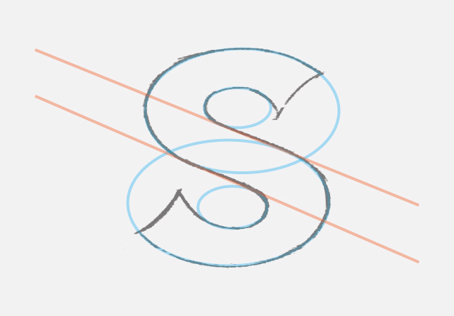
  • The Invisible 8
  • Bonus Tip

That Dreaded 'S'

The first time I tried vector tracing my hand lettering in Adobe Illustrator was for local salon logo. The whole thing was a mess, but the 'S' in 'Salon' was particularly atrocious. It took some time, but eventually I discovered that there are two basic options for tracing an 'S' in Illustrator:

  1. A freestyle trace with the 'Pen' tool
  2. A trace guided by a simple, geometric setup

These days, I routinely combine the two options, but when I was still struggling with my vector tracing skills, I leaned heavily on the guided, geometric setup. Freestyle tracing with the 'Pen' tool almost always lead to inconsistent letter thickness, flat spots on curves, and generally awkward results. With time, practice, and an understanding of the basic 'S' geometry, these issues eventually gave way to clean curves traced quickly and confidently.

The Invisible 8

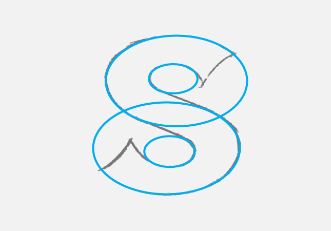
I use a method that I call the Invisible 8. It's a great technique if you're new to vector lettering. Use it as a guide for the actual trace of your 'S' or reference it as a way to improve your hand lettering. Here's how the Invisible 8 works in Adobe Illustrator:

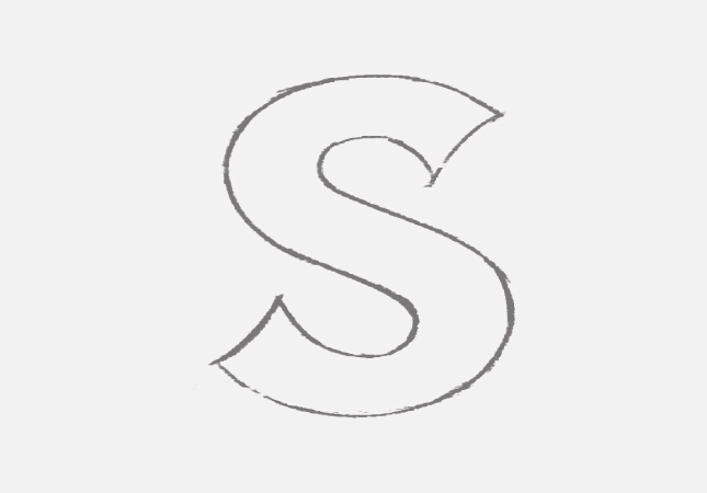
1. Sketch an 'S' and place into a locked layer at 20% opacity.

2. On a new layer, create your Invisible 8 using the 'Ellipse' tool.

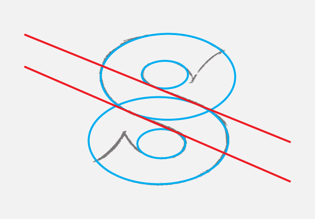
3. Add two lines that define the 'S' spine. (Allow your lettering sketch and designer's eye to define the angle of these lines.)

4. Select all your Invisible 8 lines, reduce opacity to 30%, and lock the layer.

5. Use the Invisible 8 to guide the tracing of your 'S' on a new layer. (**Bonus** Use the Invisible 8 plus pre-mapped anchor points for even more precision.)

Next Time on Type Builder

On the next installment of Type Builder, I'll be introducing something that absolutely every vector letterer should be using: The 'Shape Builder' tool.

PS...I just created the Type Builder newsletter. Sign up below to have Type Builder delivered directly to your inbox!